Music
Van Halen Album Covers - In Order, Plus the VH Logo, Band, and Cover Art
Van Halen album covers were always a sight to behold. Whether it was photography based or illustrated, they (almost) always brought artistic value to the table when releasing an album. Below are all 12 studio Van Halen album covers, both live album covers, and the two compilation album covers.
Including I, II, III, Women and Children First, Fair Warning, Diver Down, 1984, 5150, OU812, For Unlawful Carnal Knowledge, Balance.
Van Halen was anything but Butt Rock. Their entire catalog is legit, save an iffy song here or there. In fact, they are the very best band to start with the letter v. There will be no debate.
The Van Halen Image
Van Halen album covers usually did a good job of representing where the band was at during the recording of each album: Atlas holding up the world, a cannonball to the gut, conjoined twins on a see saw. You get the point.
Highlights include the four quadrant rock star formation on Van Halen I, the stark VH logo effect of Van Halen II and the Best Of: Volume One, the baby angel rippin' a pack of smokes on 1984, and the Atlas pose on Van Halen's 5150.
Note - we need to see if Mike Hsu will play more VH on 100.1 The Pike.
The Van Halen logo
The iconic VH winged logo is known worldwide to fans of the band. However, despite what you may think, the Van Halen logo is only featured on six of their sixteen total albums (studio, live, compilation).
- Van Halen I
- Van Halen II
- 5150
- For Unlawful Carnal Knowledge
- Tokyo Dome Live in Concert
- Best Of: Volume 1
The Van Halen Album Covers list
- Van Halen I (studio)
- Van Halen II (studio)
- Women and Children First (studio)
- Fair Warning (studio)
- Diver Down (studio)
- 1984 (studio)
- 5150 (studio)
- OU812 (studio)
- For Unlawful Carnal Knowledge (studio)
- Balance (studio)
- Van Halen III (studio)
- A Different Kind of Truth (studio)
- Live: Right Here, Right Now (live)
- Tokyo Dome Live in Concert (live)
- Van Halen Best Of: Volume 1 (compilation)
- The Best of Both Worlds (compilation)
Van Halen I

During the release of their debut album in 1978, Dave Bhang was brought in by Ted Templeman (producer / Warner Bros.) to provide artwork for the album. He brought photographer Elliot Gilbert along with him to capture the raw energy of the band. What he didn't see coming was EVH asking him to design him a logo.
The entire process took less than a week. How is that for client turnaround!?
Bhang and Gilbert managed to capture the very essence of the bands steamy, face-melting shows through a mix of blur, flaring lights, smoke, and all of the stage magic that a live performance at the Whiskey-A-Go-Go could muster.
And there, square in the middle of Alex Van Halen, Michael Anthony, Eddie, and Diamond Dave is the majestic wingled VH logo.
Van Halen I's album cover got straight to the electrifying point.
Van Halen II

The boys are back with the winged VH logo on display. In fact, it's the only thing on display, other than the expansively tracked Van Halen text. There's a certain bad ass attitude of standing behind your logo as the only connection to your band. You better make sure you have significant brand equity if you are going to pull it off.
They did. And they did, on the 1979 Van Halen II album cover.
Question though, if Dave Bhang needed a week to do Van Halen I, how long did just the logo (his logo) take for Van Halen II?
Women and Children First
The album cover of Women and Children First focuses on the eruption of notes from EVH's guitar. This is a more intimate cover of the band standing in a close knit group pose and a departure from the first two album covers and the VH logo.
Eddie and Michael Anthony look to be having the absolute time of their life, whilst Diamond Dave tosses playful sexy-pouty face looks at the camera.
Yeah, the band is on top of the world in 1980 for sure. Group power move for the win!
Fair Warning
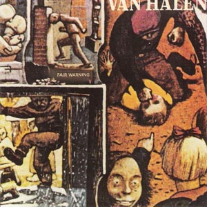
Van Halen's fourth studio album cover is comprised of several scenes from Kurelek's "The Maze". The artwork visually highlights Fair Warning's more intimidating and caliginous tone. Even the song titles of Fair Warning were more aggressive:
- Mean Street
- Sinner's Swing
- Unchained
- Push Comes To Shove
Fair Warning's artwork is the most complex of all the Van Halen album covers. Let's examine it.
In the top left quadrant, we have a guy ramming his head into a wall like a goat. In the bottom left, we have a man kicking someone in the back. In the bottom right, we have a couple of people pointing to a Christmas Story, Ralphie/Scut Farkus style beating in the upper right.
This is a far cry from Van Halen I's four quadrant ode to rock heroism that focused on Alex, Eddie, Michael, and David individually. 1981 Van Halen was already a bit different than 1978 Van Halen.
The hauntingly troubled cover art fits thematically with the album. I mean, we aren't talking Napalm Death. Van Halen still does Van Halen things. It's just a shift in their lyrical and musical content, and it's represented visually by pieces of "The Maze".
If you were to view "The Maze" in its entirety, you would see that the scenes from Fair Warning's album cover played out across a cross-section of an opened skull, lying somewhere in a field. More scenes of torture and loneliness are found inside, including a man tied to a whipping post. The Van Halen News desk does a great job expanding on the story behind Fair Warning's cover art.
Diver Down
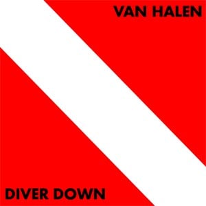
The 1982 Diver Down album cover is quite literally the diver down maritime signal flag used as a safety warning for oncoming vessels.
So, what does it say about the band?
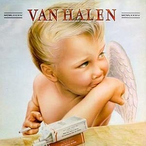
1984
Nothing might have captured the spirit of the band visually like the album cover to Van Halen's 1984. A cherubic angel smokin' some butts perfectly aligns with radio (and MTV) darlings, Jump, Hot for Teacher, and Panama. For fun, we've ranked Panama among the best hair metal songs of all-time.
As discussed prior, this isn't a death metal concert with spikes and pierced body parts. Van Halen was THE mischievous of the Sunset Strip, the ultimate partying rock band. They were about (most) triumphant fun and oblitteratingly hilarious hijinks. The little rebellious angel is just pure symbolism for everything Van Halen.
Watch the Hot for Teacher video and tell me that the 1984 album cover isn't perfect.
CLASS DISMISSED!
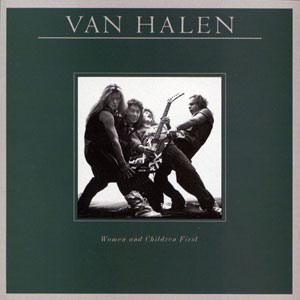
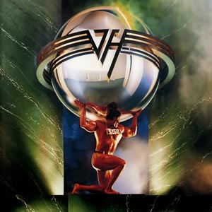
5150
[5150][2] had some solid tunes, including Why Can't This Be Love and Dreams.
The 5150 album cover could make a strong argument as the best of all of the Van Halen album covers. That the album is the foundation to the band's world at the time, especially with changes on the microphone, is a very strong statement to make. 1986 was a big year for the band.
The "Atlas" on the cover is Rick Valente, a former bodybuilder and ESPN show host.
OU812
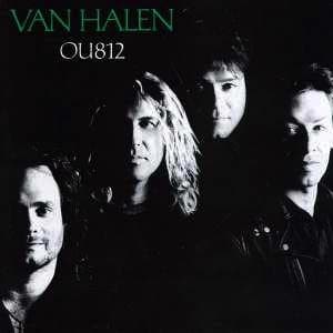
Is this art? Or, did they need to remind people who was in Van Halen? Not sure what the OU812 album cover says about the band.
I do know this, speaking on position only, perhaps the artwork foreshadowed Michael Anthony's exit from the band? EVH is clearly on the top, followed by equal ground for Sammy and Alex.
This was also around the time when Bill & Ted made the convincing argument to recruit Eddie Van Halen into Wyld Stallyns. They needed EVH in 1988, along with a triumphant video and actually knowing how to play. Even without Eddie, the Bill & Ted's Excellent Adventure Soundtrack had killer songs.
For Unlawful Carnal Knowledge
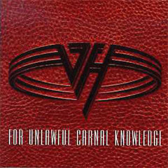
While the Van Halen logo is always a strong play, it's a bit muted on the For Unlawful Carnal Knowledge album cover due to the background material it sits on: leather? vinyl? polyester? not a clue ...
But that was kind of the vibe in 1991. If you're asking us, that looks like a dodgeball.
Balance
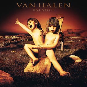
1995's Balance album cover has some heft. Glen Wexler really delivered with the photography and concept on Alex's request to explore "the duality of the human psyche".
Wexler's positioning of the conjoined twins was a subtle nod to the Van Halen logo. Balance represented exactly where the band was at, both in title and visually. The band was coping with the death of manager Ed Leffler and Sammy was entering his last year with the band.
Van Halen III
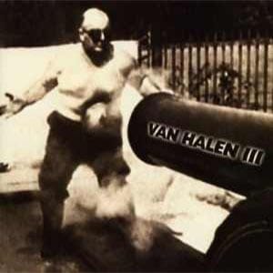
And there they were, taking a cannonball to the gut to prove that they could. Hint: it didn't work in 1998.
The Gary Cherone era just wasn't Van Halen. Don't get me wrong, the Van Halen III album cover is actually quite good, except for the text overlaid on the cannon.
Art direction for the Van Halen album cover came from drummer, Alex Van Halen's future wife, Stine Schyberg. Stine might have provided the art direction for the album, but Frank "Cannonball" Richards is the true star, taking a 104 lb. cannonball to the stomach.
All in the name of rock'n'roll!
A Different Kind of Truth

Winged logo? Check. And that's all you really need for this forgettable album. 2012's A Different Kind of Truth does fill out the variety found on Van Halen album covers with a powerful, (potentially) speeding vehicle.
Live: Right Here, Right Now

I see you there, Lawn Jesus. The Live: Right Here, Right Now album cover is most interpretive. Here are the questions I have:
- To whom does Lawn Jesus belong, the house intact, or the one being destroyed?
- If destroyed, did someone place Lawn Jesus upright?
- Is this allegorical for where the band was at in 1993?
Sammy was still firmly entrenched as the vocalist and For Unlawful Carnal Knowledge was still strong in the eyes of the public.
That leads me to believe that this is just interpretive, 90s art. Do with it as you will.
Tokyo Dome Live in Concert

Hey, I know what we need ... a big boat.
Is this how the band traveled to Tokyo? I'm confused. There is nothing of consequence happening on 2015's Tokyo Dome Live in Concert album cover.
Perhaps that is for the best.
Van Halen Best Of: Volume 1

Pure class. Succinct. Concise. And more. Van Halen's Best Of: Volume 1 has an album cover that is really perfect. Not the stuff of legend, just only what it needs to be.
The Best Of: Volume 1 album itself is a collection of rock masterpieces.
The Best of Both Worlds

2004's The Best of Both Worlds album cover lets you know exactly where the band is at - all Eddie. The logo doesn't grace the album cover. The band doesn't grace the album cover. Concept art doesn't grace the album cover.
What does? A design modeled after Eddie's Frankenstrat. Sara Cumings and Jeri Heiden, the art direction and design on The Best of Both Worlds, didn't have to stretch to their creative limits on this one.